Competition
Re-imagining Travel in The Future
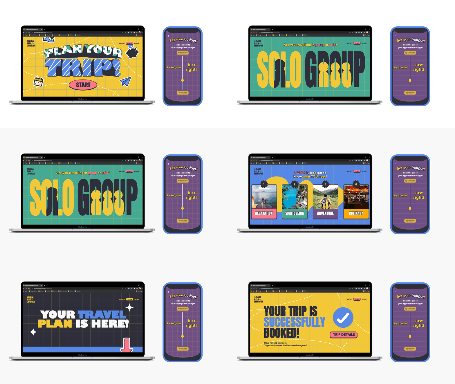
Semua Bisa Liburan features a product that simplifies travel planning, budgeting, and booking into one seamless experience and also enhances the overall travel experience by incorporating AR and rewards system.
Role
Project Lead, Graphic & Motion Designer
Duration
5 days (Dec 2021)
Team
Adrian (Research & Content), Andhika (Research & Content), Jocelyn (Writer)
HiLo Design Thinking Marathon
The Competition
The competition was held by Singapore Tourism Board, HiLo and Pahamify. It was divided into 3 rounds; Elimination Round (Design Thinking Worksheet), Semi-finals (TikTok Campaign), and Grand-finals (3 minutes - 3 slides Pitching Competition).
However, I will be spotlighting the Grand-finals part, since it is more focused on the problem & solution that I’d like to convey.
Our Chosen Topic
Re-imagining Travel in the Future
Based on the competition guidelines, the solution we formed should answer all of these questions:
1. How will technology enhance the traveling experience after the pandemic?
2. How to promote a destination site to teens?
3. What are the needs of teens that should be fulfilled during traveling?
4. What products & services should be developed by destination sites to attract teen travelers?
Defining the problem & phenomenon
Teens are digital natives and love #instant things
Sources: Hotel Marketing & Expedia, 2016 | Skift, 2017 | Salecycle, 2021 | Trekksoft, 2019 | Google/Ipsos, 2016
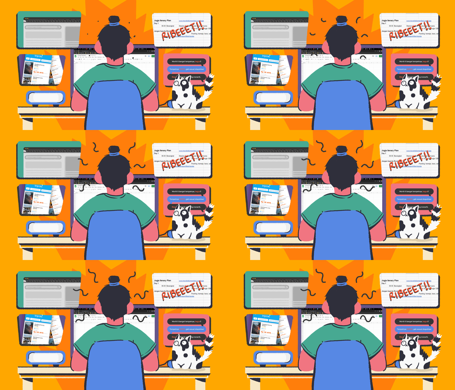
INEFFICIENT TRIP PLANNING
Planning a 5-7 days trip requires 45 days & searching through 160 sites
Where in reality, GenZ only has 25 days for holidays in 1 year.
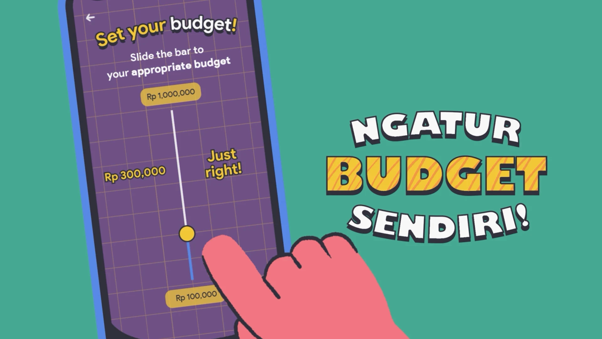
BUDGET AS MAIN PRIORITY
81% of GenZ consider budget as the most important factor during trip planning.
Where in reality, GenZ only has 25 days for holidays in 1 year.
PERSONALISATION
90% of travelers wants a personalized trip planning experience
DIGITAL NATIVES
4.88 million of people uses
handphone & internet during travelling
Personalised Travel Quiz
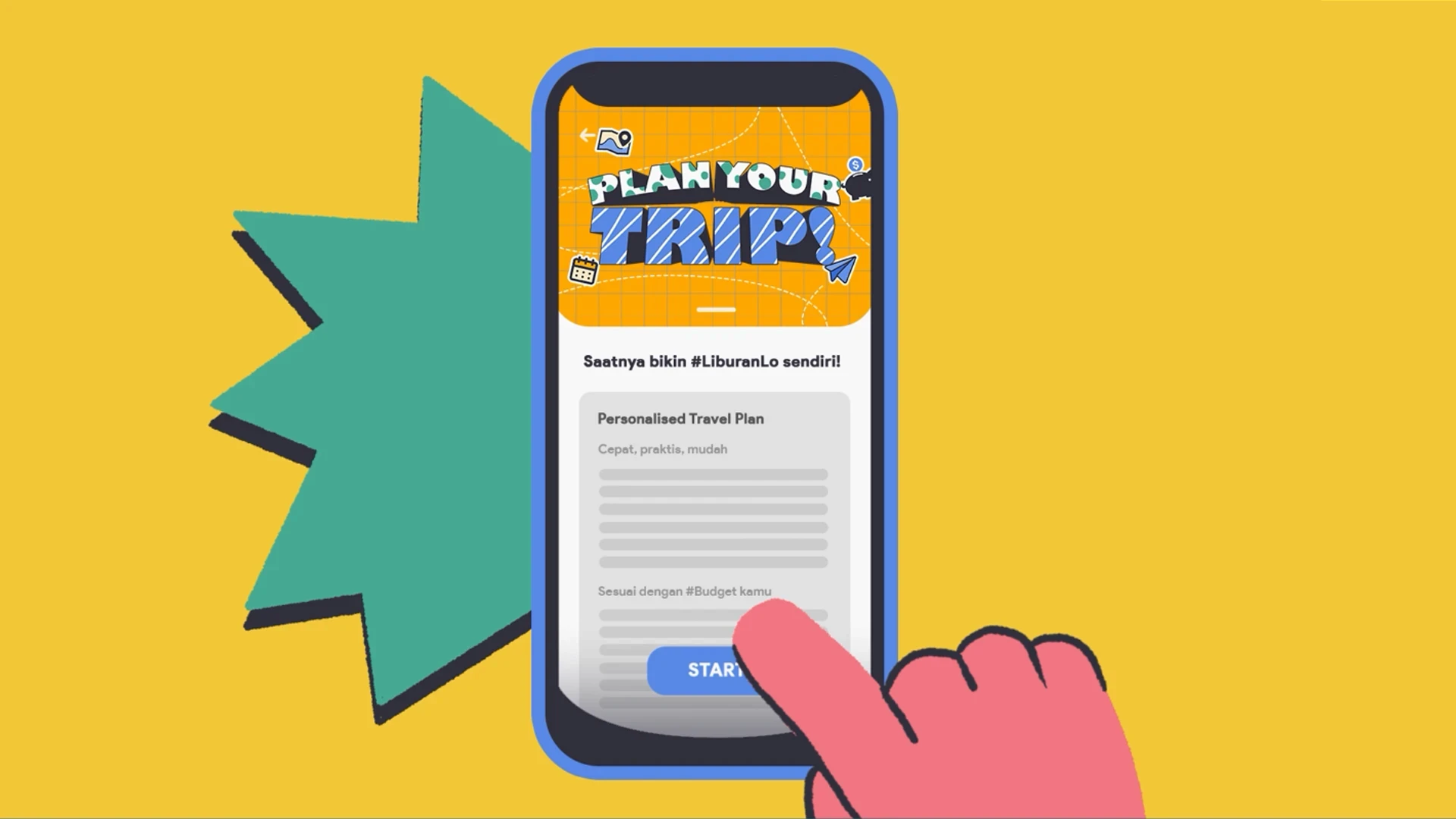
Easing the user’s booking process through Travel Quiz where questions will be served in a fun-friendly style to create an anti-boring planning experience. By gathering the explicit interactions data from the quiz, the recommendation engine (AI) will tailor a recommendation plan such as hotels or transport that is most suitable for the user’s budget, goals, and vacation type.
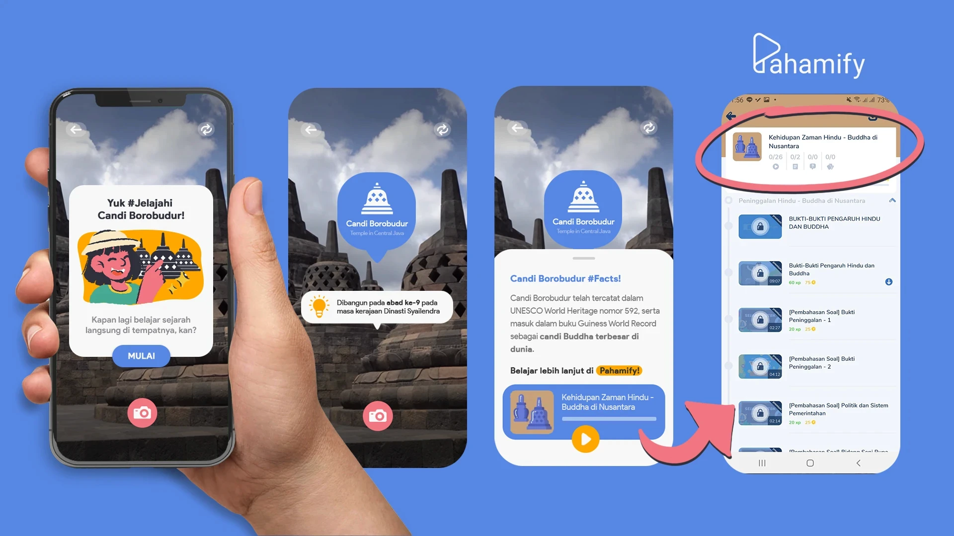
Augmented Reality Feature
Allows users to explore historic places in an exciting way and find interesting bite-sized information directly on spot. To learn more about the history, our application & website will be connected with Pahamify in the history section. We felt that Indonesia’s history could be highlighted so teens could be interested to learn more about our culture-rich country.
Rewards Feature
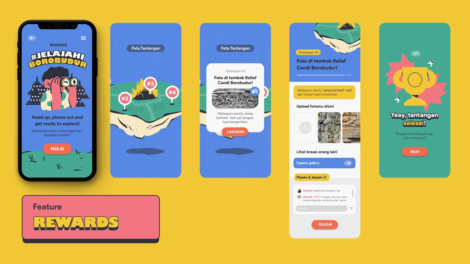
Provides every destination site with different arrays of challenges. These challenges aim to encourage users to explore & learn more about the places’ history. A comment section will be placed on the same page to invite users to share pictures, give reviews and build a traveling community.
Okay, I've heard enough of the solutions, what about the pitching itself?
Since we were only given 3 minutes and 3 slides. We decided to use a grabber video for our introduction.
So, this is that breakdown:
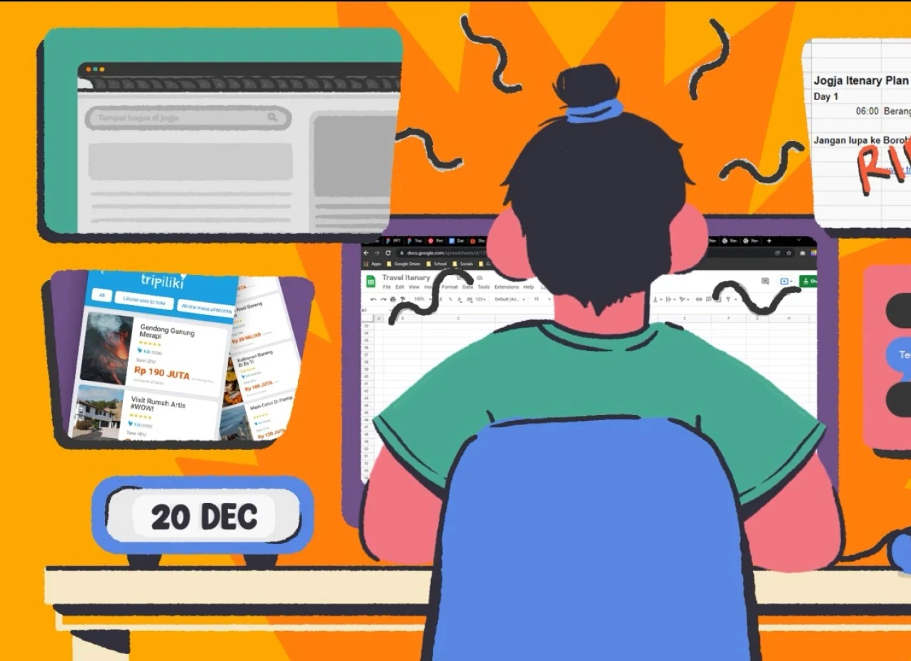
Concept
Vibrant, relatable, and cats. Yes
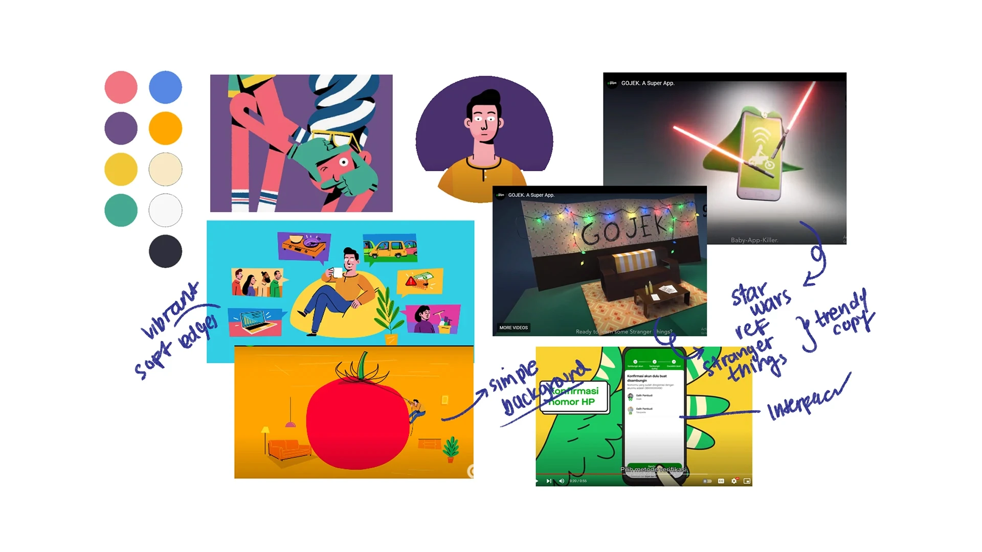
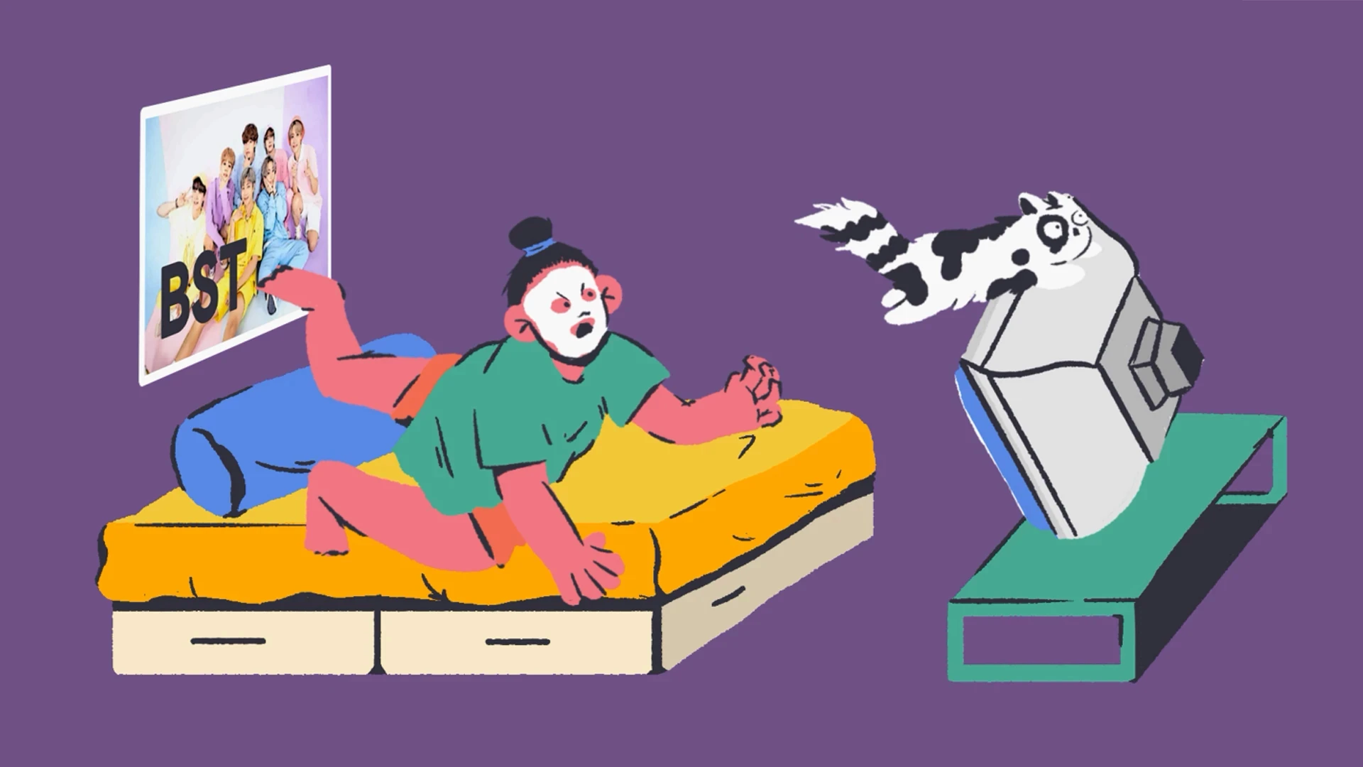
The video is heavily inspired by GoJek’s SuperApp and SOLV video. Visual wise, we use vibrant colors and soft edges illustration to fit our target users - GenZ, we want it to appear friendly and welcoming.
Furthermore, by correlating trends and GenZ likings such as Korean Dramas as metaphors, we aim our copy for the video to be catchy and relatable for the viewers.
Below is the mood board of our concept.
Storyboard
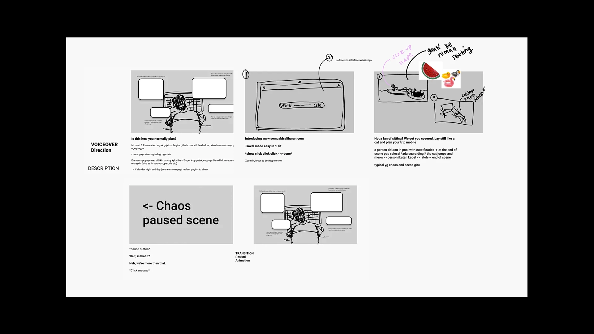
The Pillars of Our Video
These frames are the backbone of our video. Some scenes are improvised directly during assets creation and animation, so it is not 100% similar.
Execution
Creating & Animation
The visual assets were sketched, outlined, and colored in Photoshop. This array of scenes will then be animated in After Effects and composed in Premiere pro with the voice-over and necessary sound effects. The frame-by-frame animation that was applied to the cat, aura lines, and spikes, were done in Photoshop as well.
Reflection
Key Takeaways
All in all, I really enjoyed working on this project! + super proud of the outcome (despite of only having 5 working days to finish the pitching materials because of exams 😬).
However, things I would improve if I was granted more time are.. spending more time in creating user flow before jumping right into designing the user interface and create usable prototype using Figma, hehe! I didn't do this because I wasn't sure how to export the component individually since I need to animate it in After Effects 😅, so to save time I decided to design the UI in photoshop.
...
check out my other works?


